This week has been challenging, to say the least, and trying to get started on designing my office has been almost impossible. As I wrap up Spring 2023 – WEEK 2 of the One Room Challenge (ORC), I have barely made any headway in getting my office designed.
Now if you are wondering, what wait, where is the week 1 blog post, it was never written. Instead, I decided to join last minute and posted on my social media.
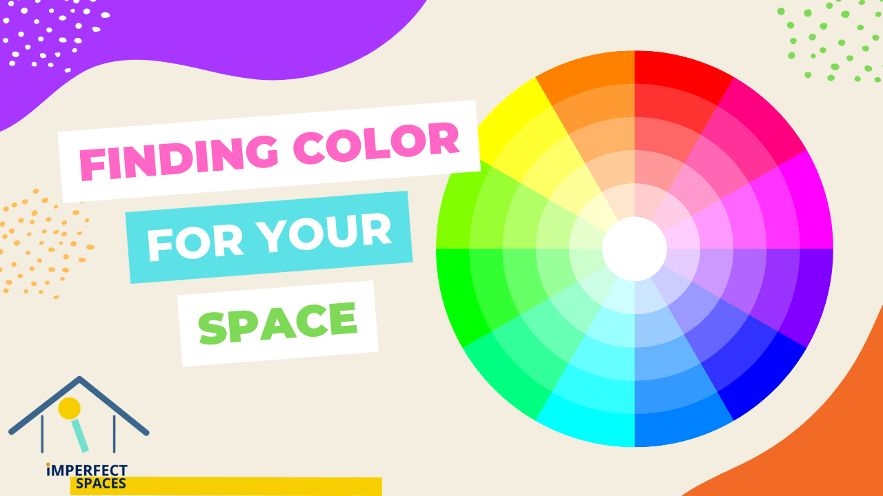
This office space is being designed with lots of colors so let’s get into a color theory which is part art and part science. When it comes to designing an interior home space, choosing the right colors is essential. It can make or break the overall look and feel of the space. This blog will discuss the basics of color theory and how to pick colors for interior home spaces.
Here are some of the basic design elements for my office space: follow me on Instagram to see updates on this project:
Note: this article has some affiliate links, and I receive a small commission.
The Basics of Color Theory
Color theory is based on the color wheel, which consists of primary, secondary, and tertiary colors. Primary colors are red, blue, and yellow, and they cannot be created by mixing other colors. The secondary colors are green, orange, and purple, and they are created by mixing two primary colors. Tertiary colors are created by mixing a primary color with a secondary color.
There are three basic color schemes that can be used to create a harmonious and visually appealing design. These are:
- Monochromatic: This scheme uses different shades of the same color. For example, if you choose blue as your main color, you can use light blue, navy blue, and everything in between to create a cohesive look.
- Analogous: This scheme uses colors that are next to each other on the color wheel. For example, if you choose blue as your main color, you can use green and purple as your secondary colors.
- Complementary: This scheme uses colors that are opposite each other on the color wheel. For example, if you choose blue as your main color, you can use orange as your secondary color.
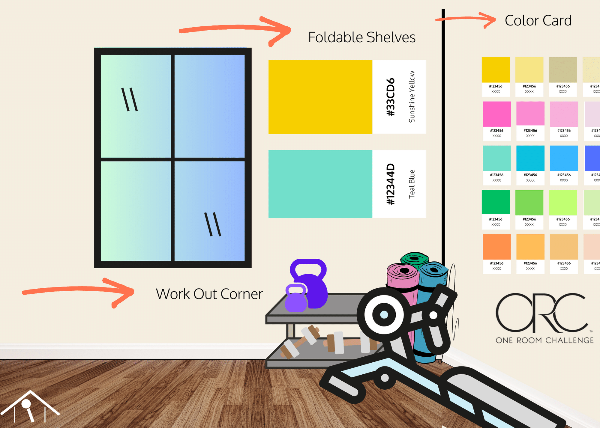
However, for the color of my office, I have decided to leverage color combos from HGTV HOME collect with Sherwin Williams that can be found at LOWS. The color cards from the collection really give me some options and leverage some of my favorite colors I used in my child’s room a few years ago.
Picking Interior Paint Color
However, if you’re trying to figure out color there are a few ways to go about it. Get started with Pinterest and see what is drawing your eye and design for the space. Next, you are going to want to think about the following:
- Lighting: The amount and type of lighting in a room can affect how colors appear. Natural light can make colors appear brighter and more vibrant, while artificial light can make them appear duller.
- Room size: The size of the room can also affect how colors appear. Lighter colors can make a small room appear larger, while darker colors can make a large room feel more intimate.
- Existing decor: The colors of existing furniture and decor in the room should also be taken into consideration when choosing new colors. The new colors should complement the existing ones rather than clash with them.
- Personal preference: Ultimately, the colors chosen should be based on personal preference. The colors that make you feel happy and comfortable should be the ones that are used in your home.
Now for this space am going with a lot of colors but there will be some main colors, secondary colors, and then an accent color to complement it. The other main part of this space to balance all this color is I am going to leverage the natural color on the wall to break up the color for this small space.
If you have gotten this far color theory is an essential part of designing an interior home space. By understanding the basics of color theory and considering factors such as lighting, room size, existing décor, and personal preference, you can choose the right colors to create a harmonious and visually appealing design. Whether you choose a monochromatic, analogous, or complementary color scheme, the key is to create a space that reflects your personality and makes you feel at home. Finally, remember especially with paint color, you can always paint over it, it is not permanent.

